Monash University CL28
Monash University CL28
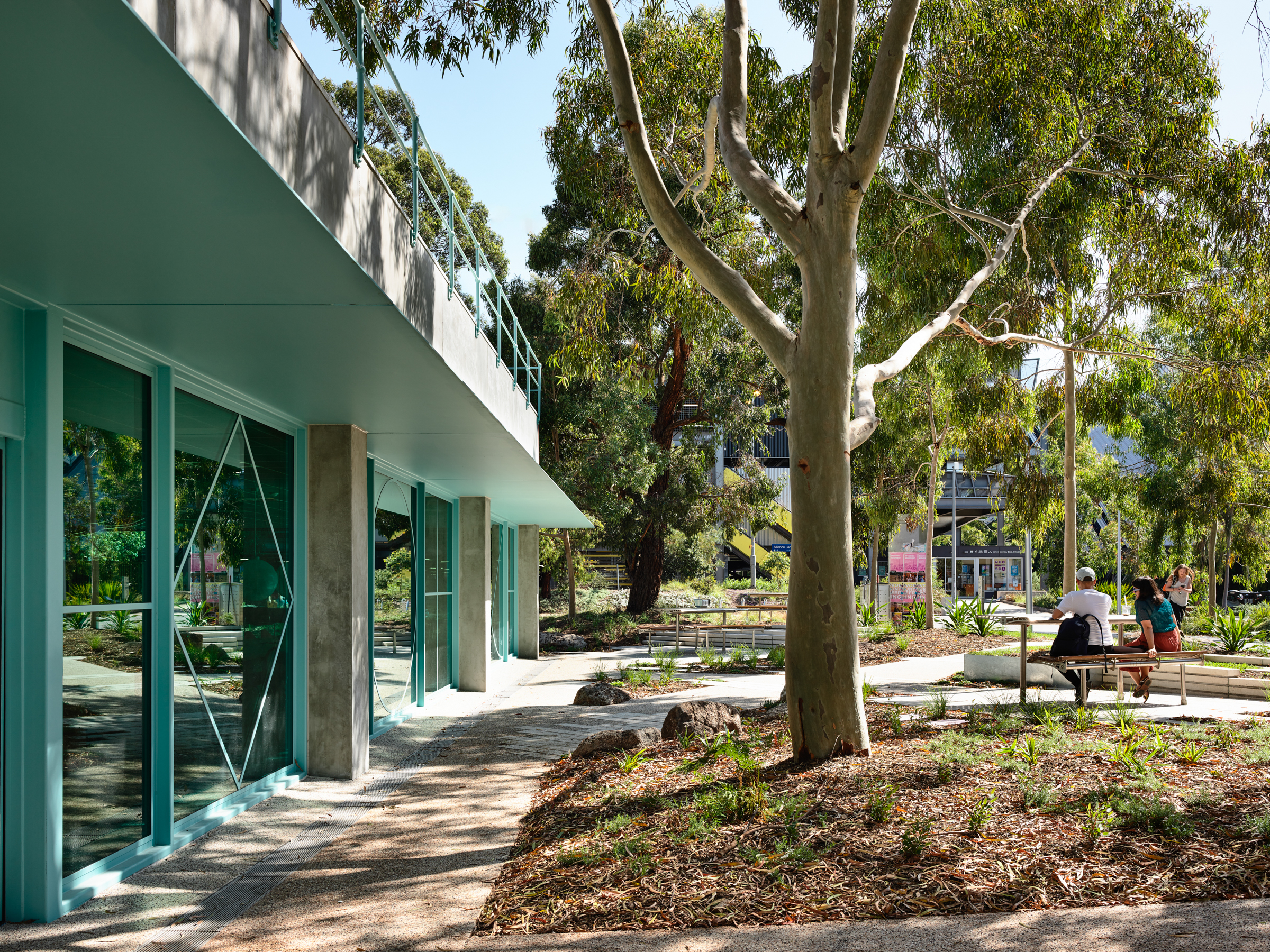
A university building with a strong and important connection to the adjacent landscape and wider university community.
Traditional Land Owners: Bunurong People
Builder: Kapitol Group
Landscape Architecture: Bush Projects & Emergent Studios
Photography: Tom Ross, Derek Swalwell
Awards:
2021 Victorian Architecture Awards: Commendation - Interior Architecture
Media:
Artichoke Magazine - Issue 74, 2021
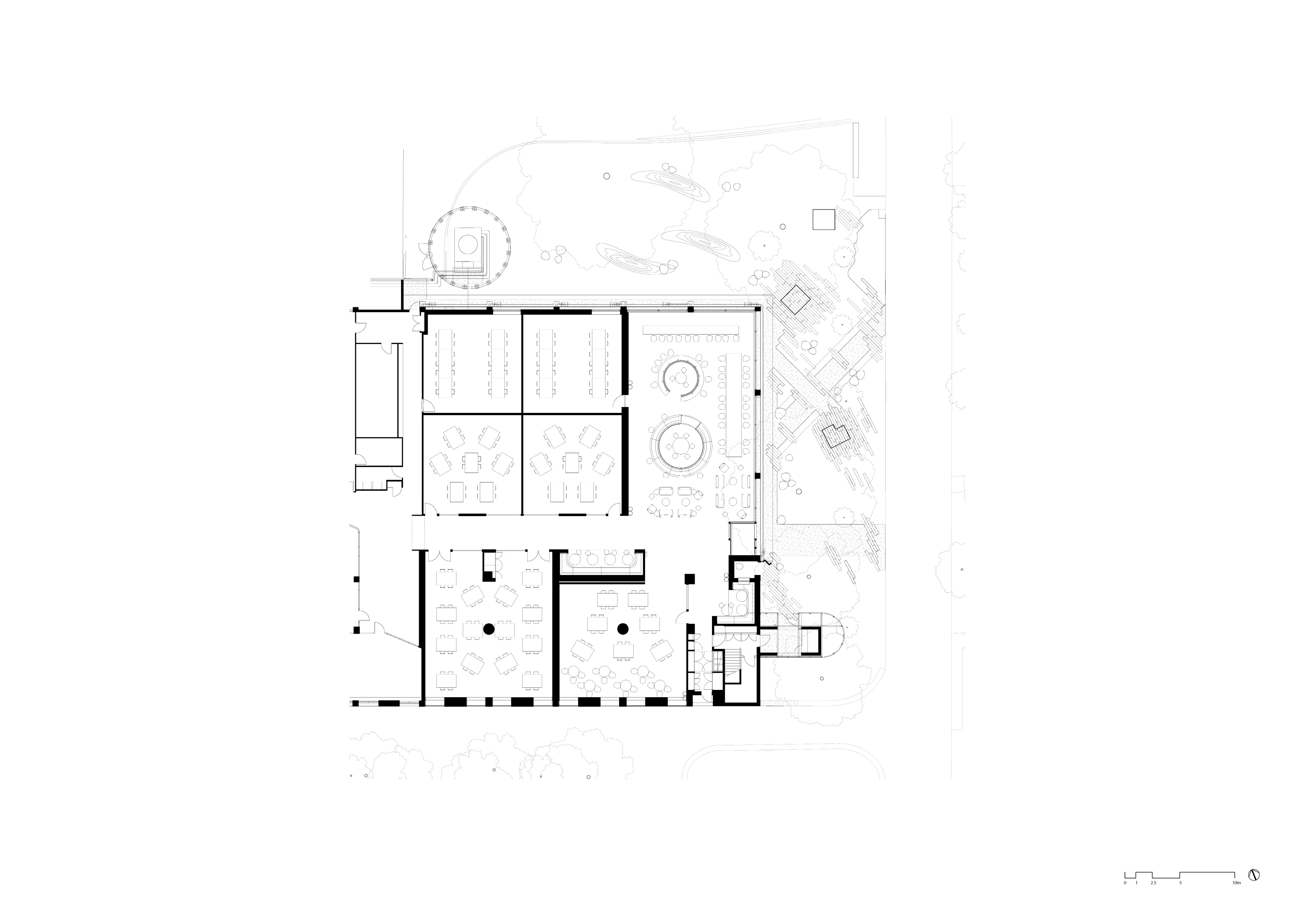
View plans here
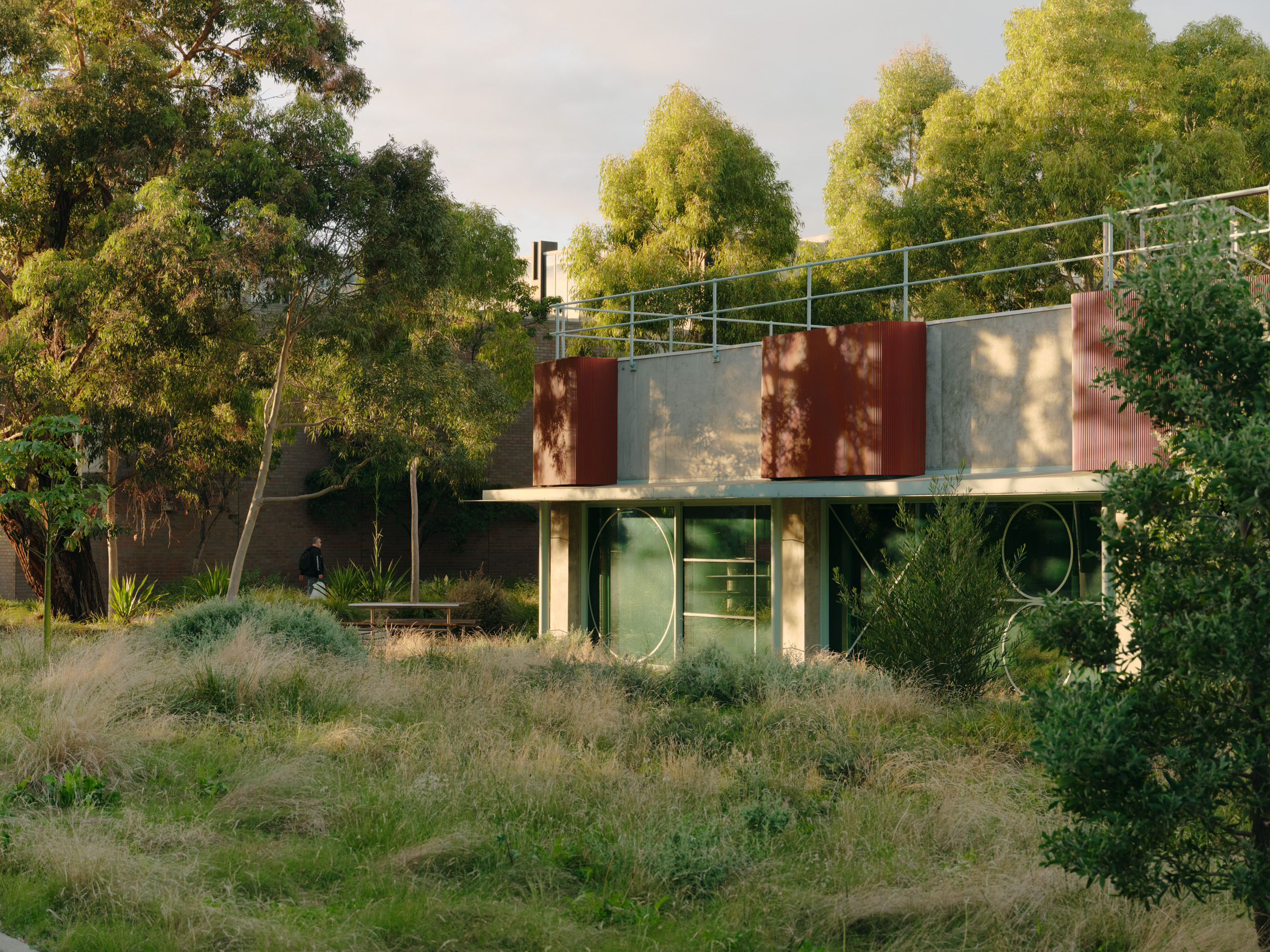
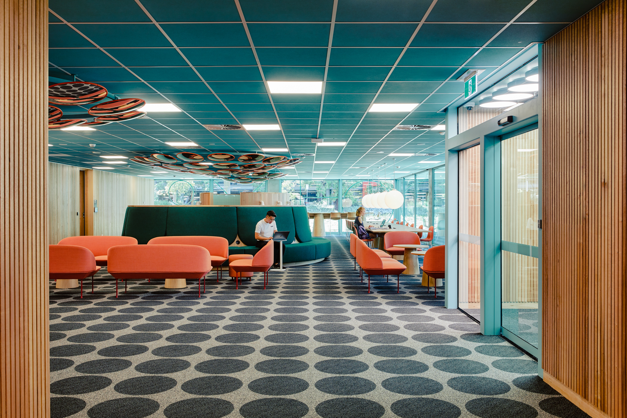
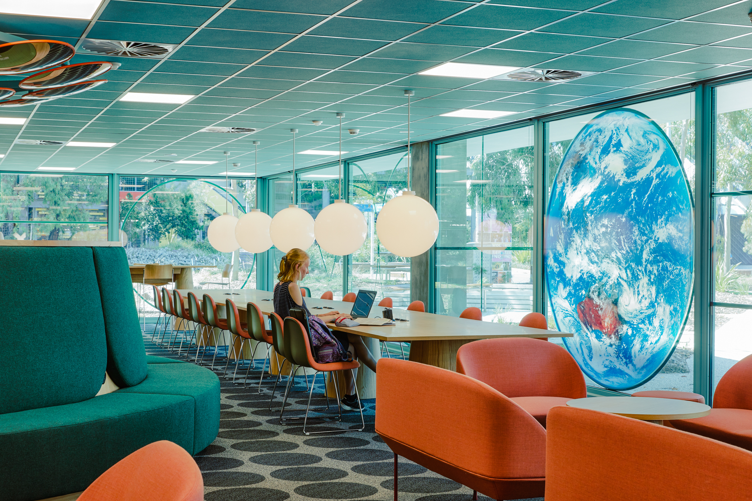
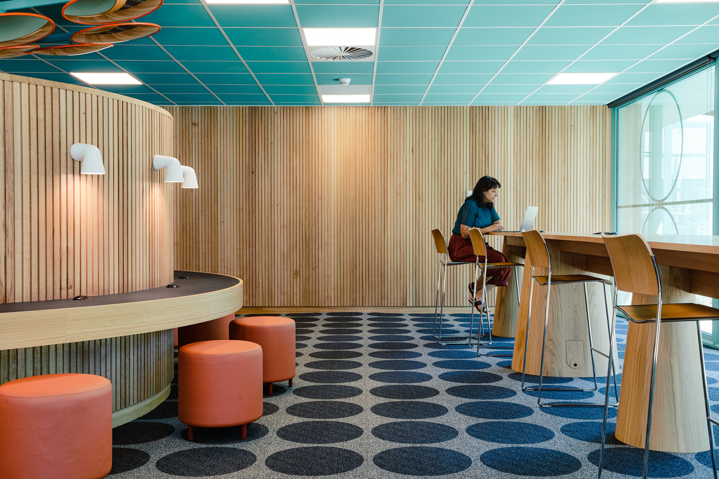
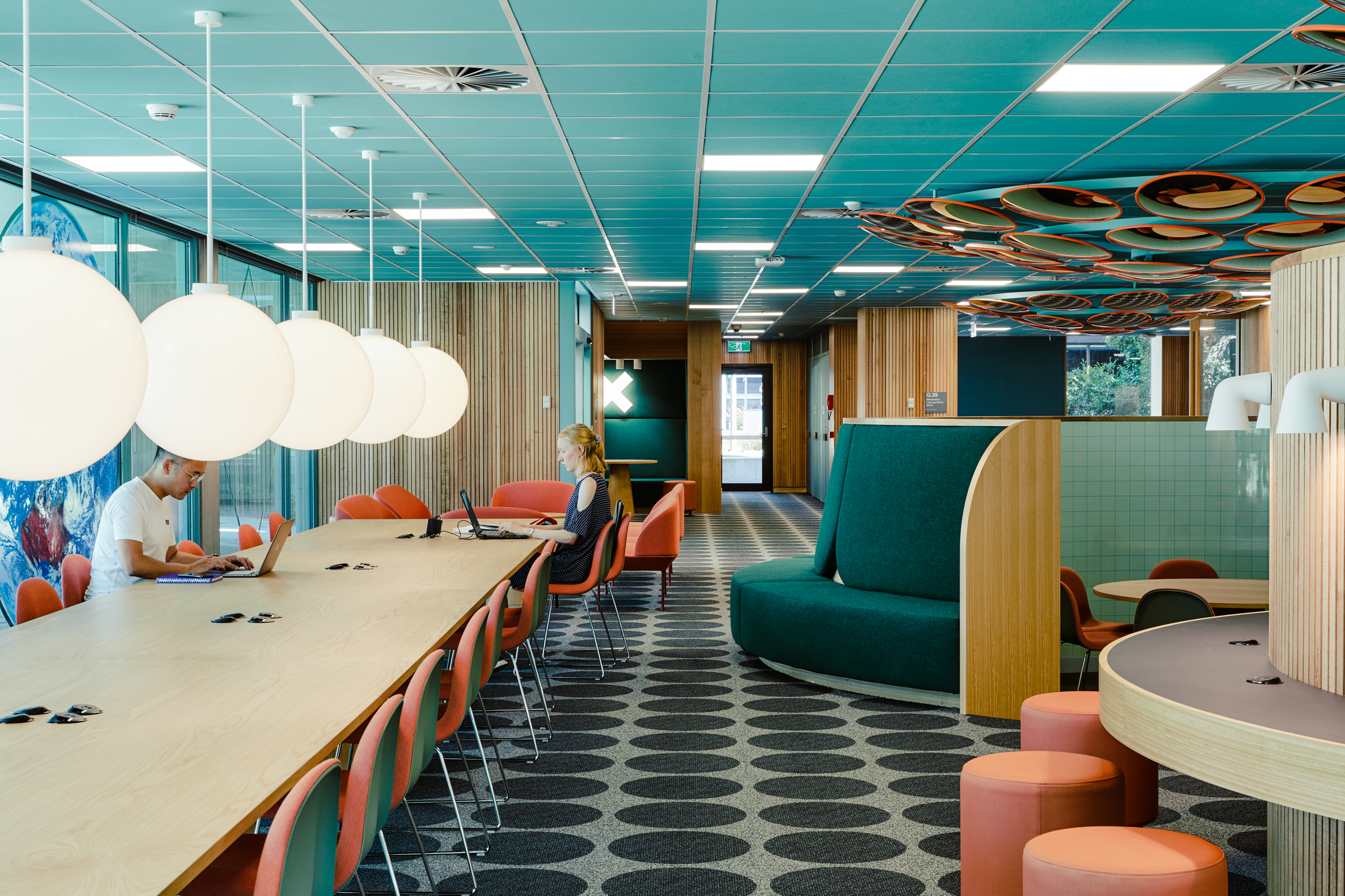
The ‘Centrally Managed Teaching and Maths Learning Centre’ (CL28) is a series of formal and informal learning spaces within an existing building at Monash University. The informal spaces were to offer flexible and social spaces that facilitate student engagement; places to encourage learning, creativity, collaboration and engagement with community and industry.
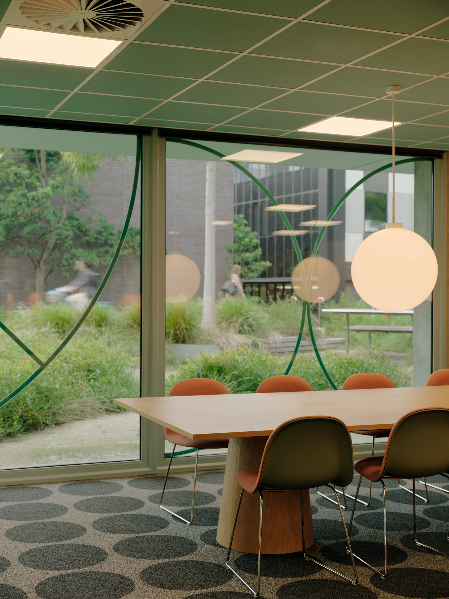
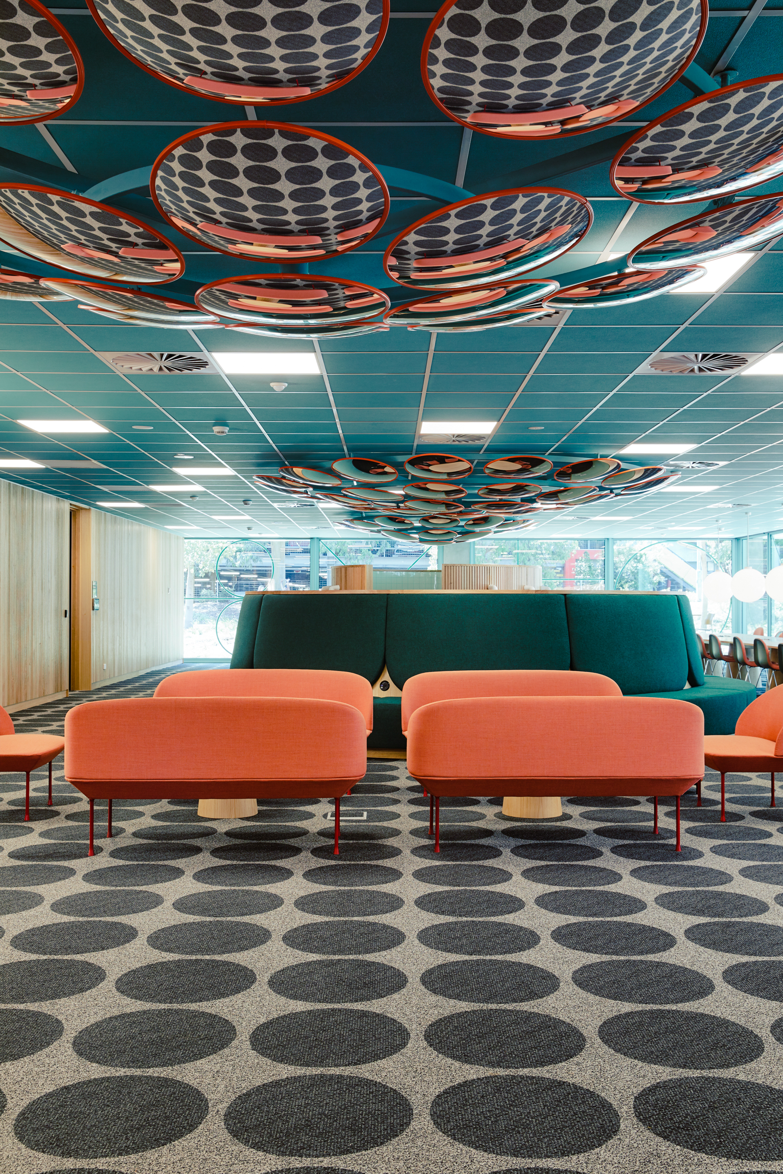
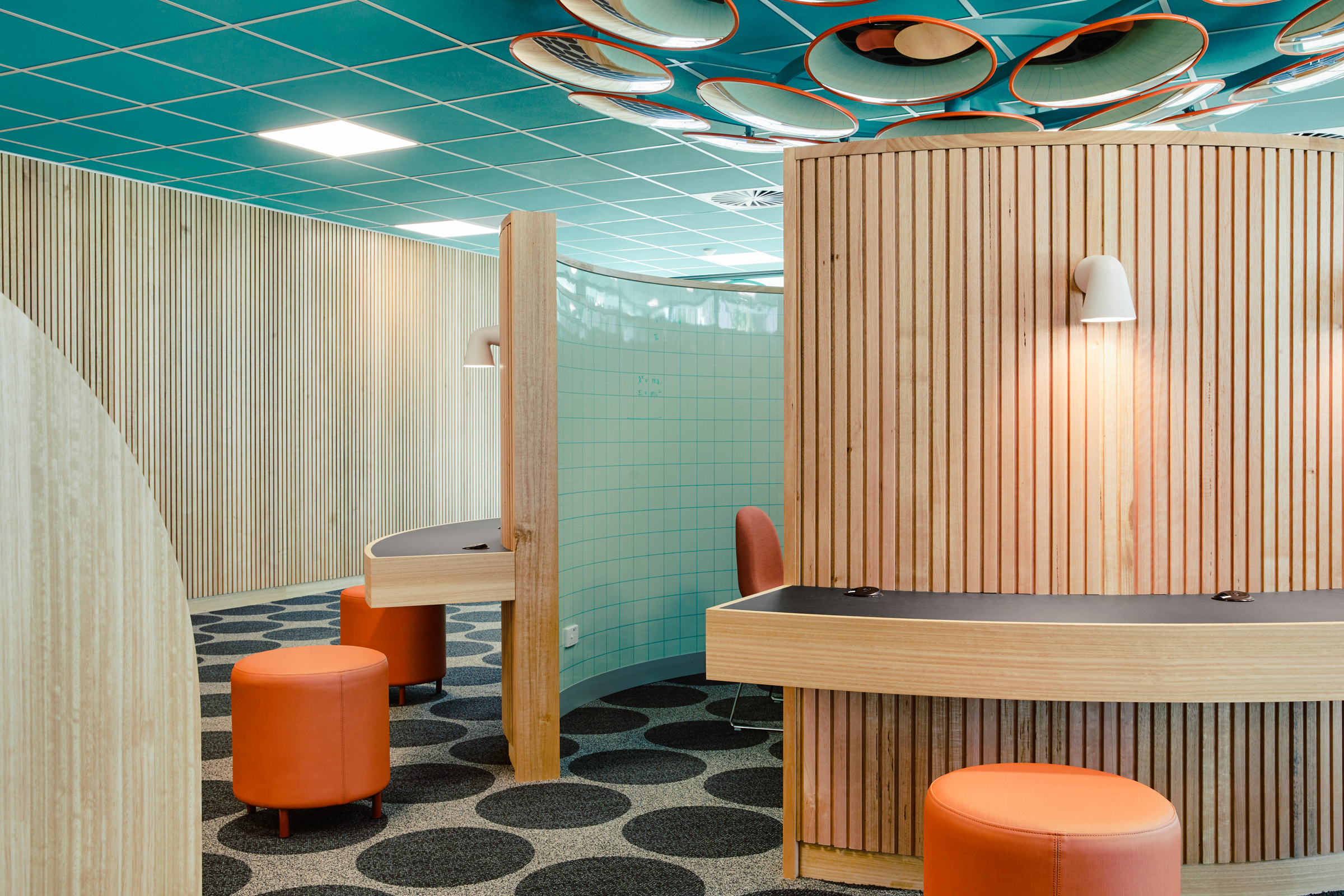
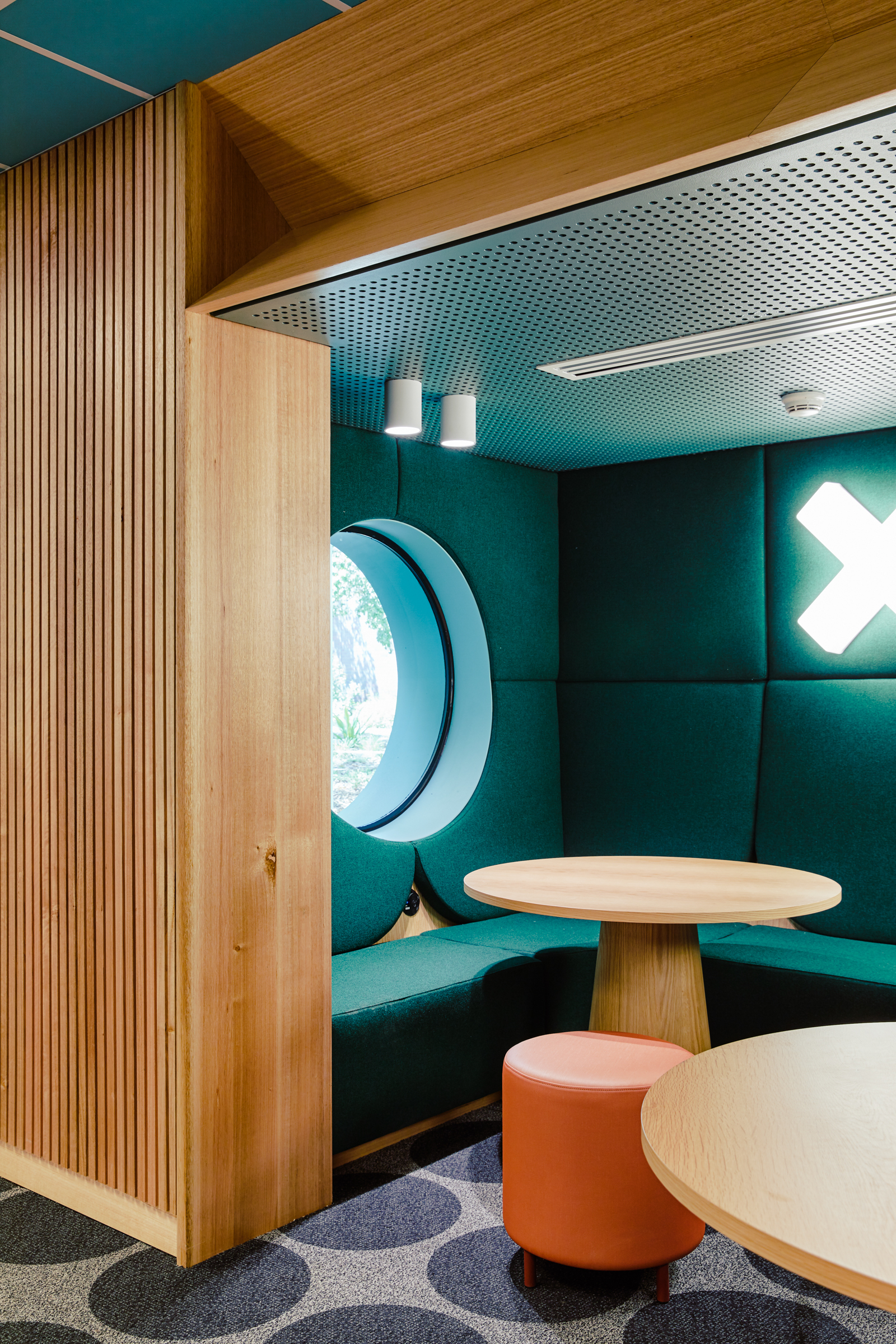
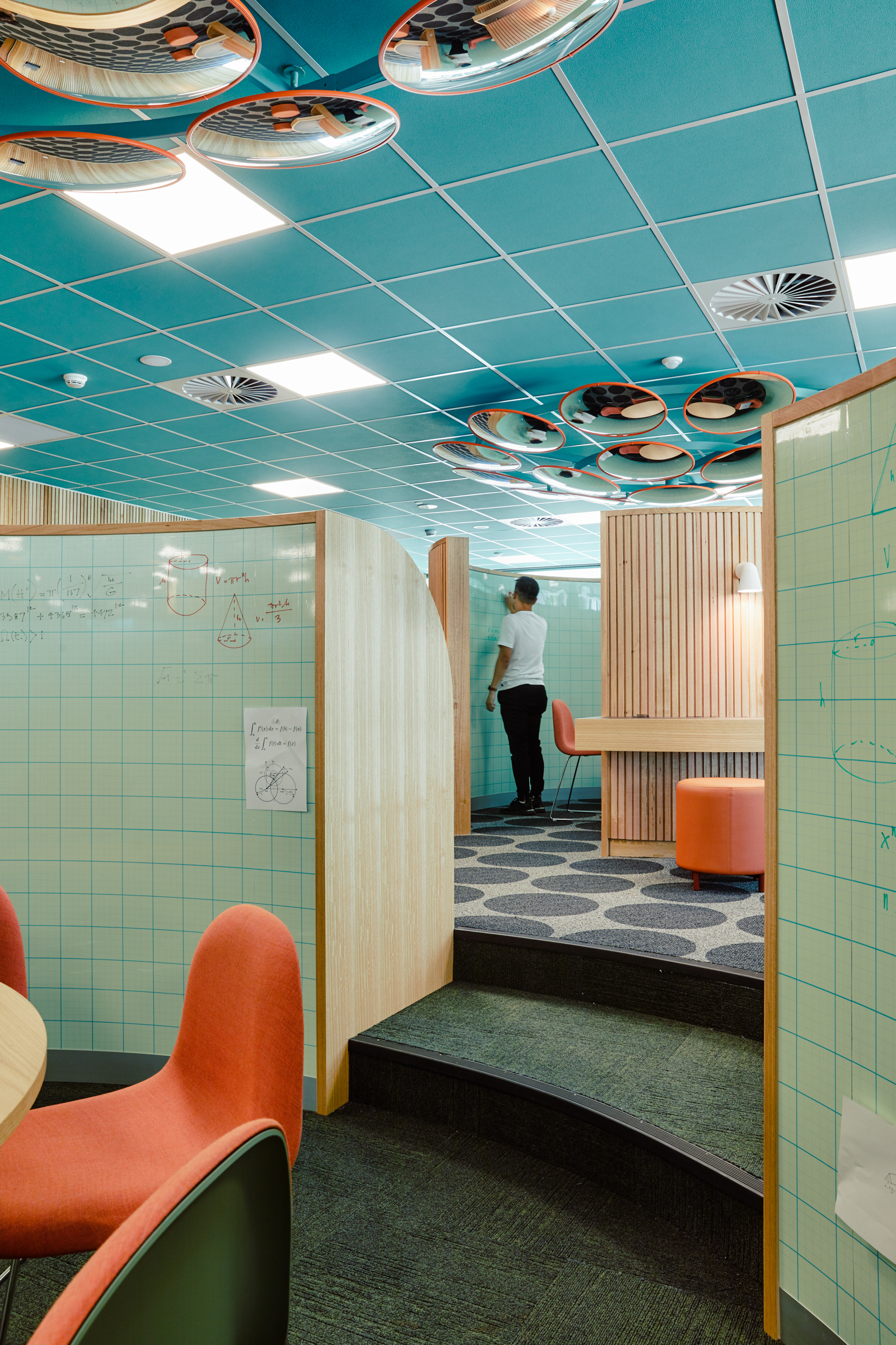
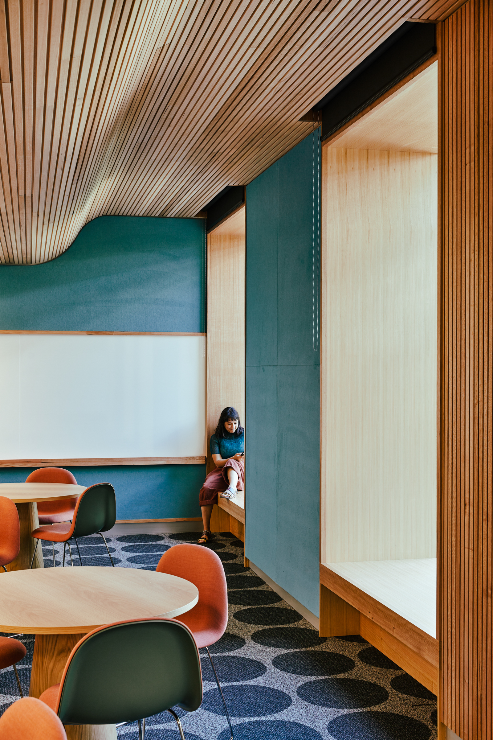
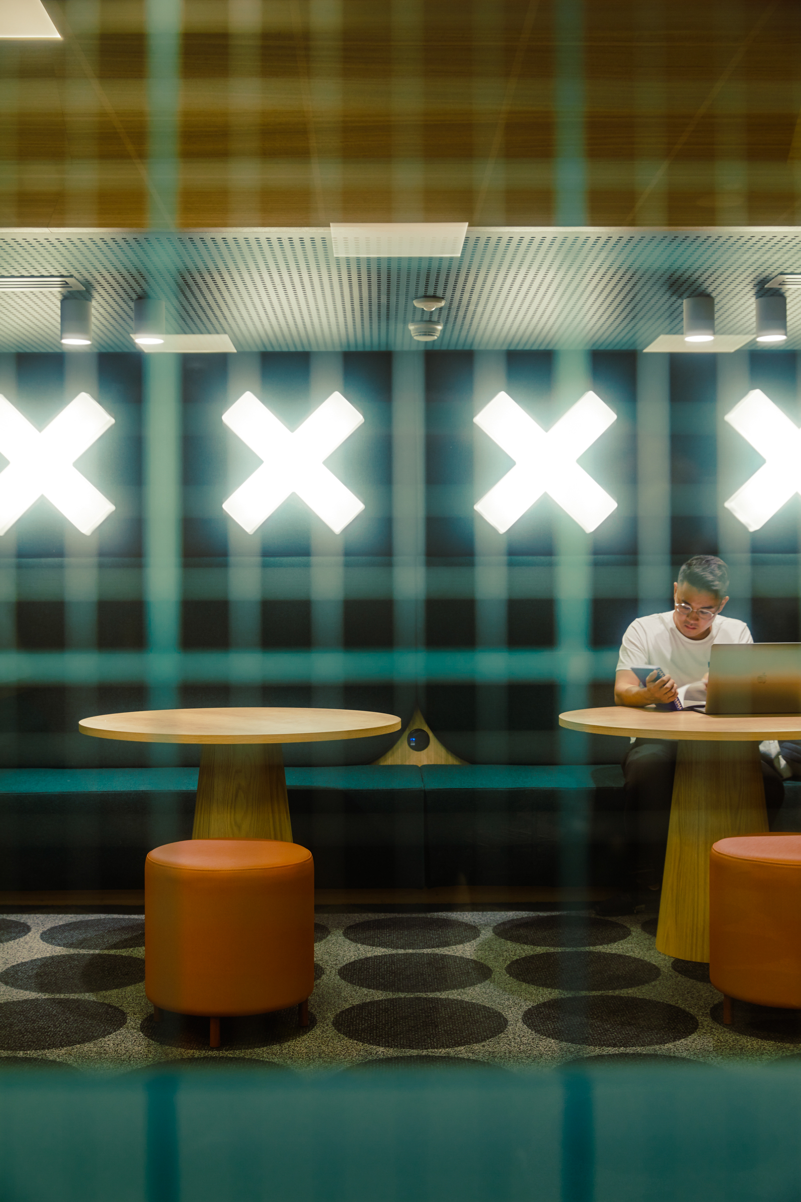
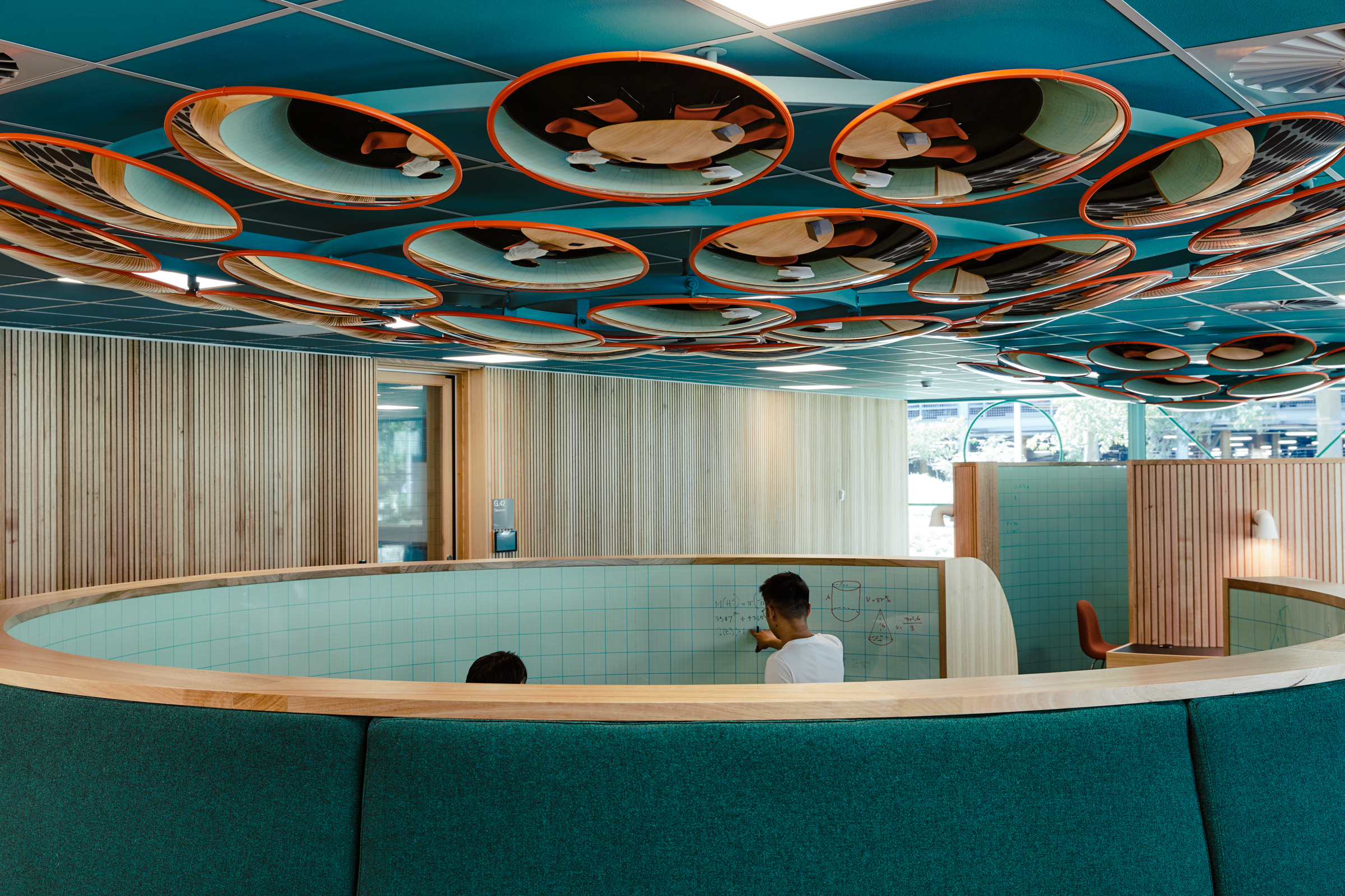
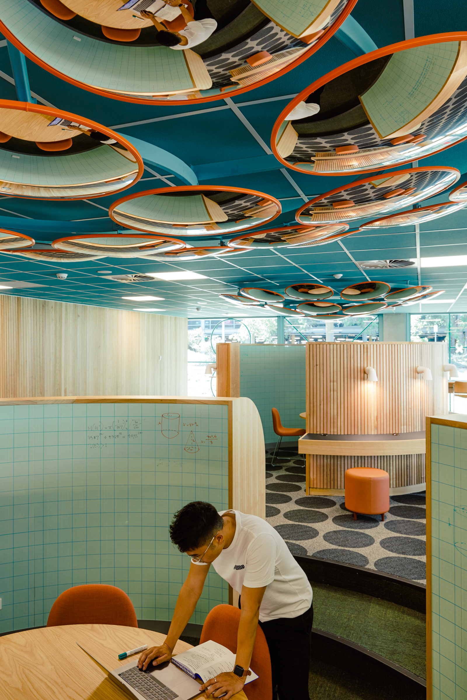
The brief required student lounges that could cater for a diverse range of student types – introvert, extrovert, solo workers, group workers, students working in a formal or relaxed fashion. Our approach was to consider how furniture types and arrangements could support in intimate or convivial formats and to make provision for alcoves with soft acoustics and lower lighting as a refuge from more social spaces. Another key briefing requirement was to deliver a design that felt specific to the department of mathematics and earth, atmosphere and environments, but not is so overt as to render the facilities redundant if they were required for another faculty or student cohort. Accordingly, references are coded and subtle.
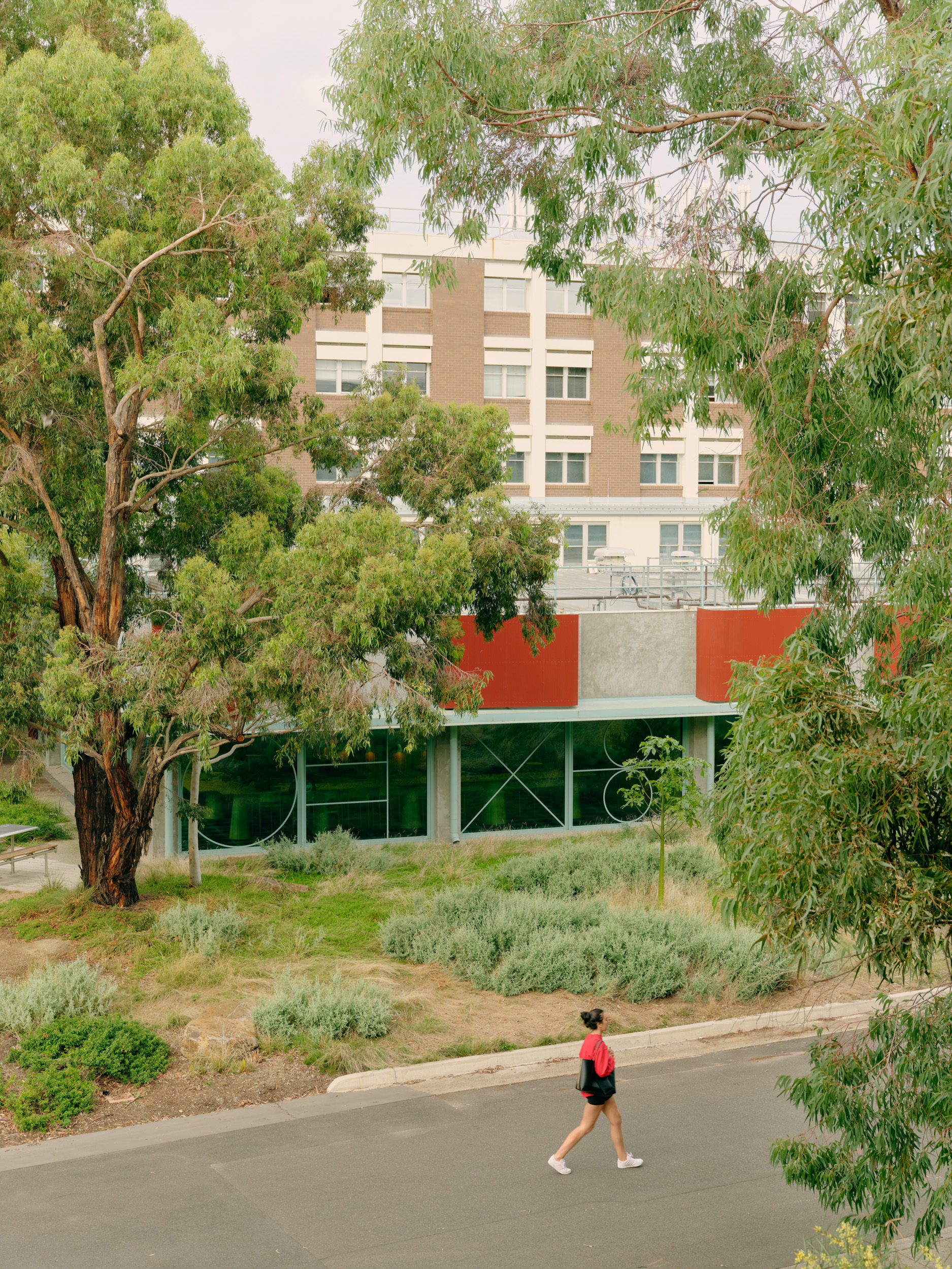
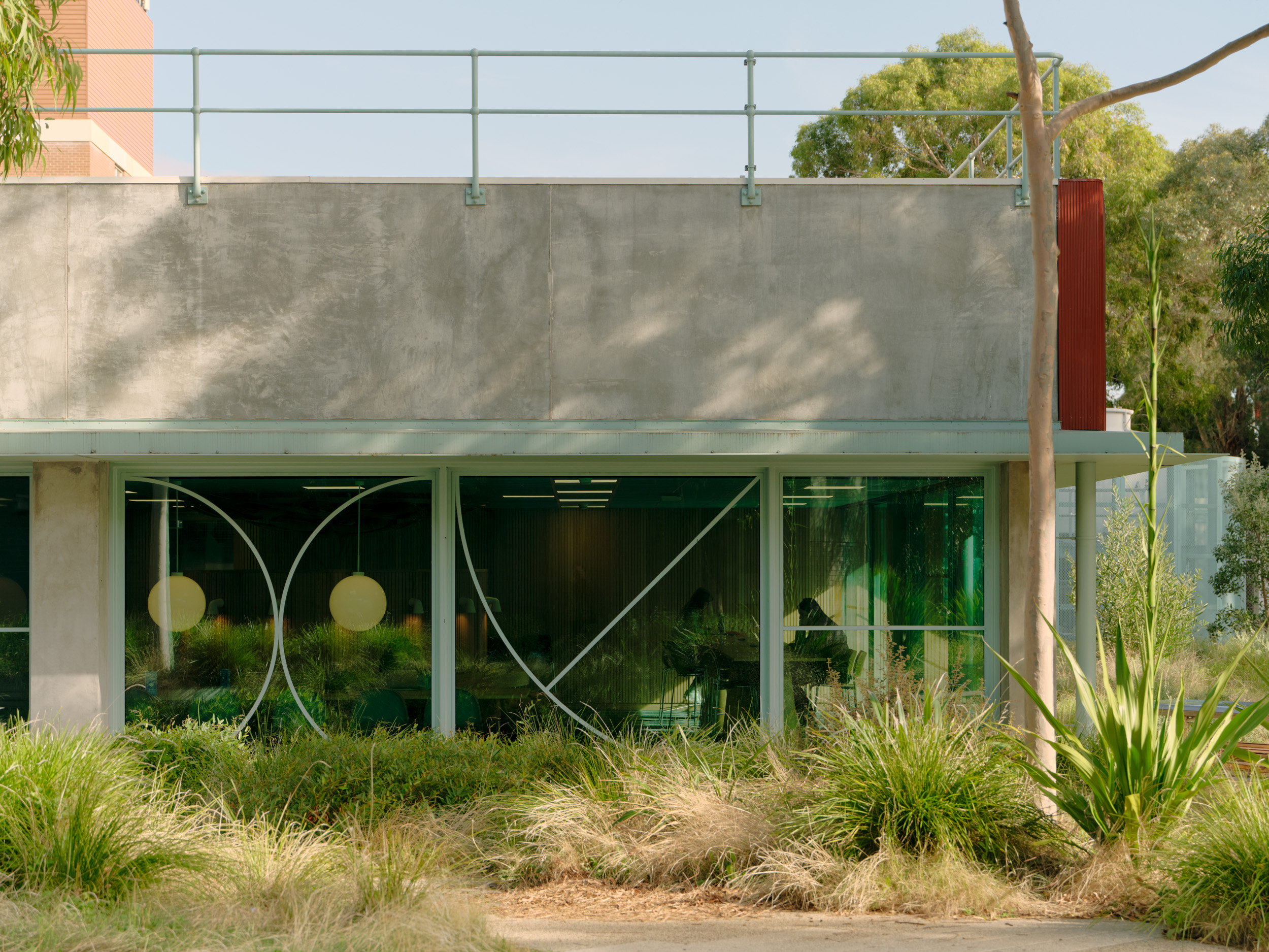
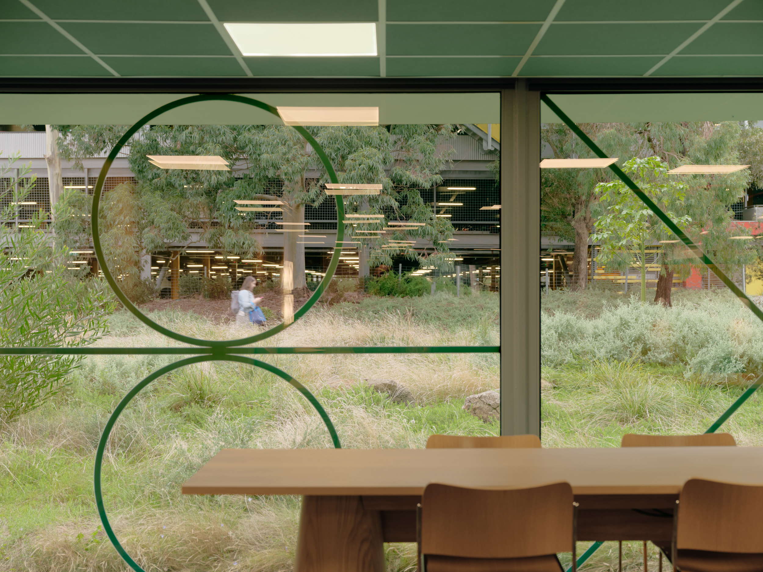
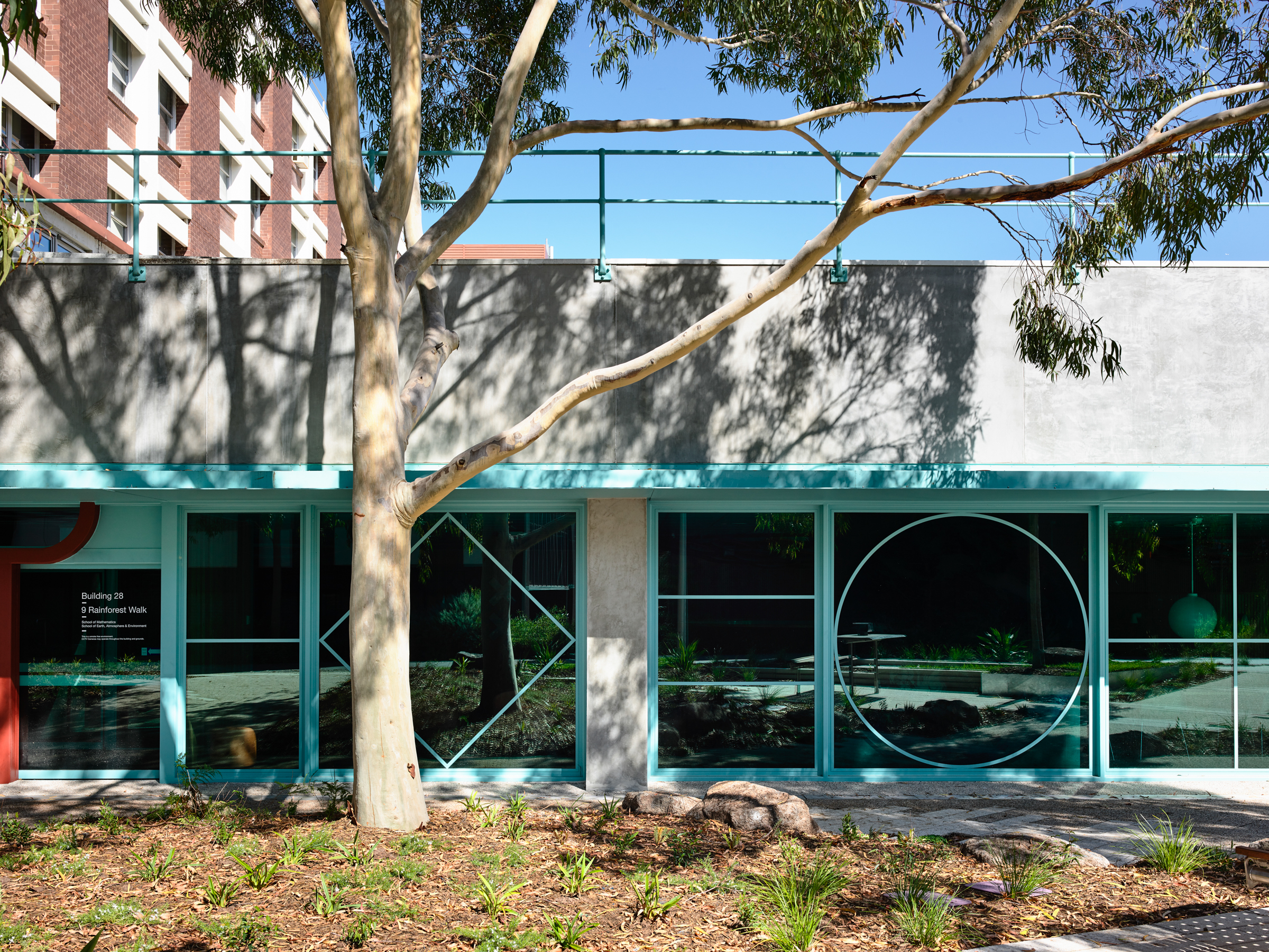
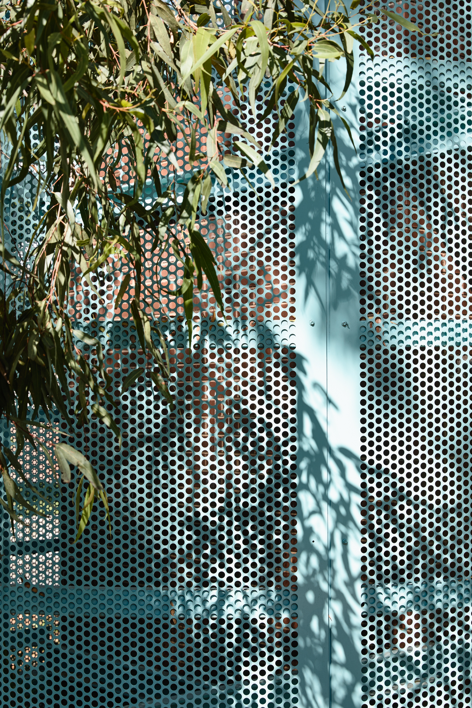
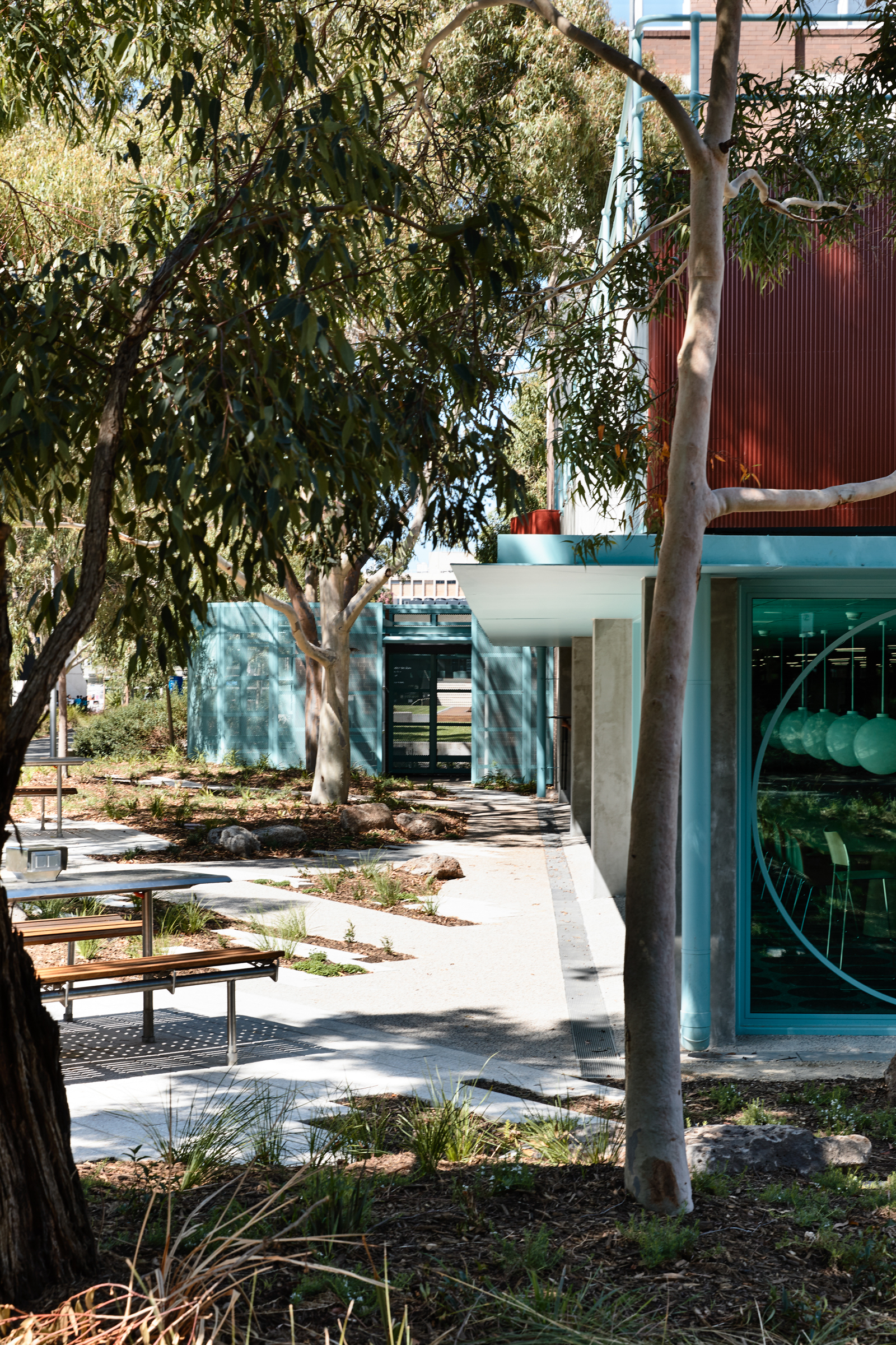
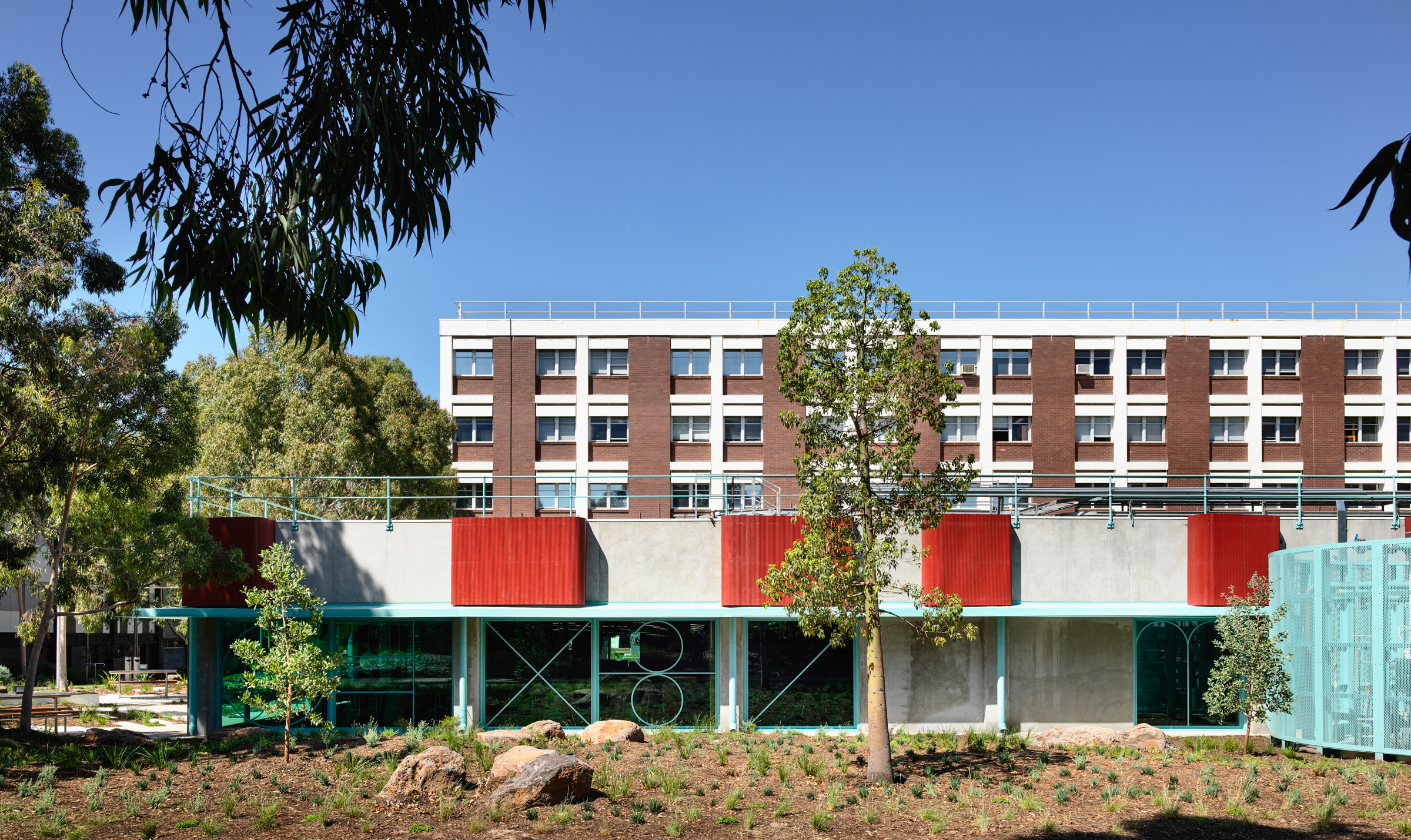
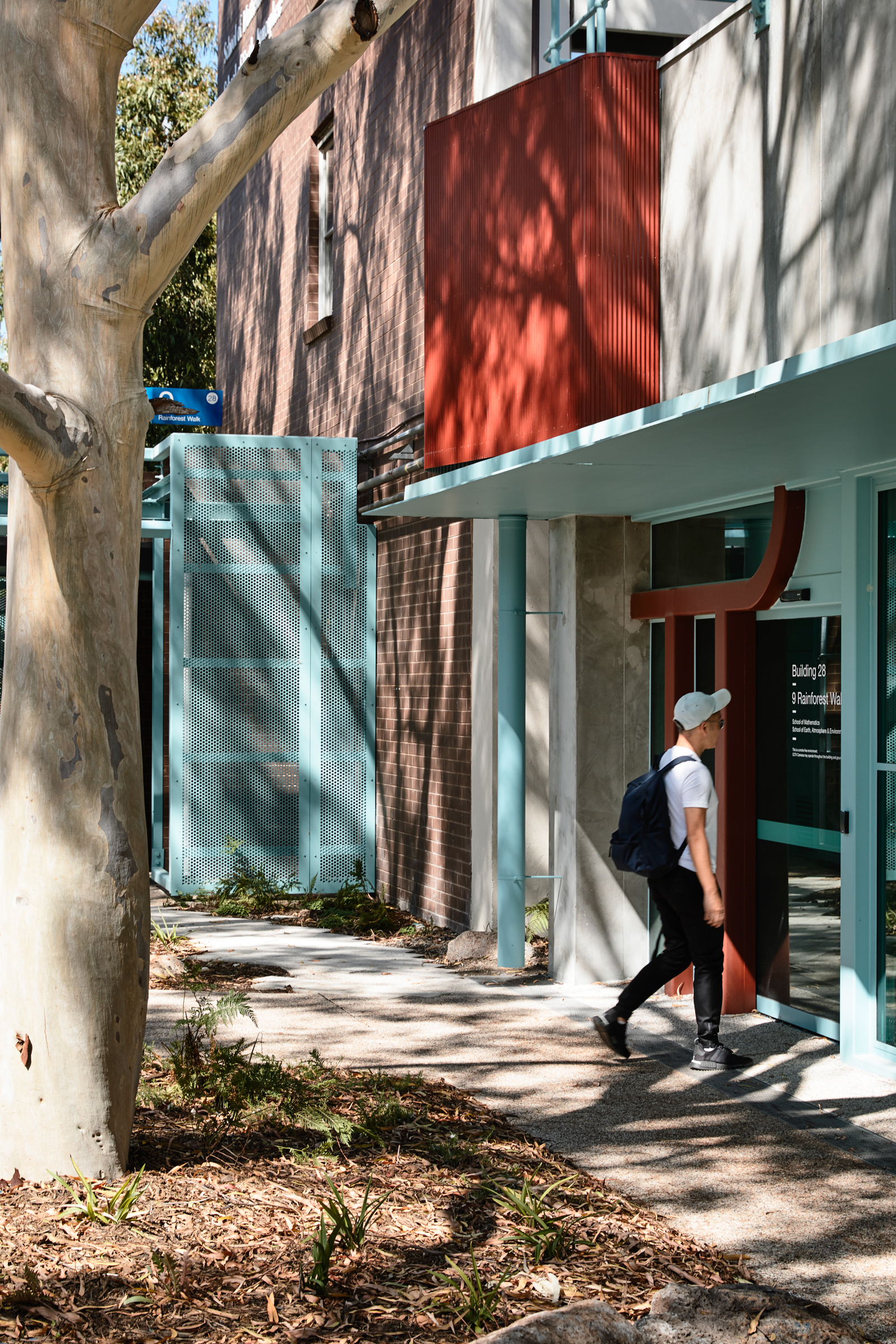
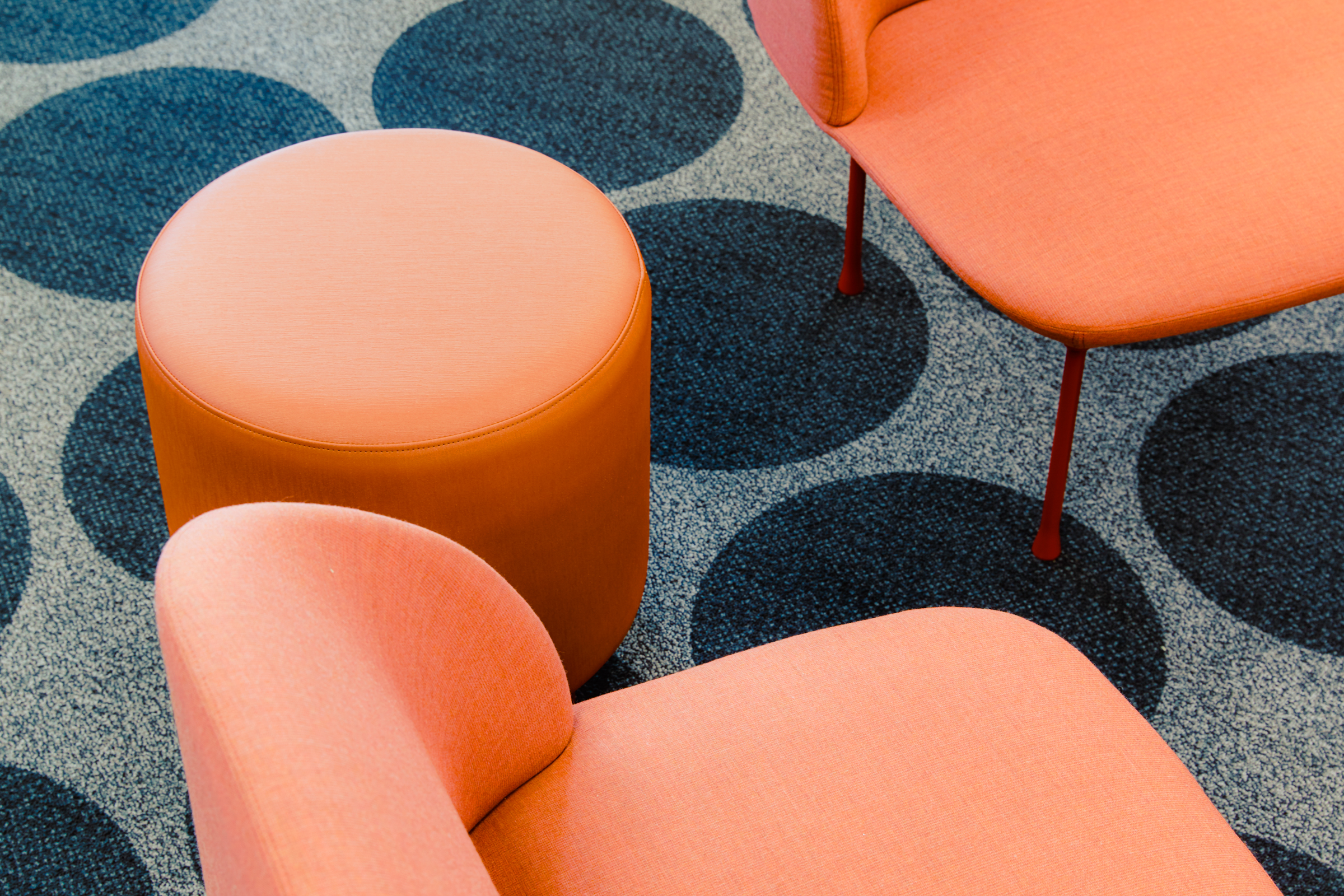
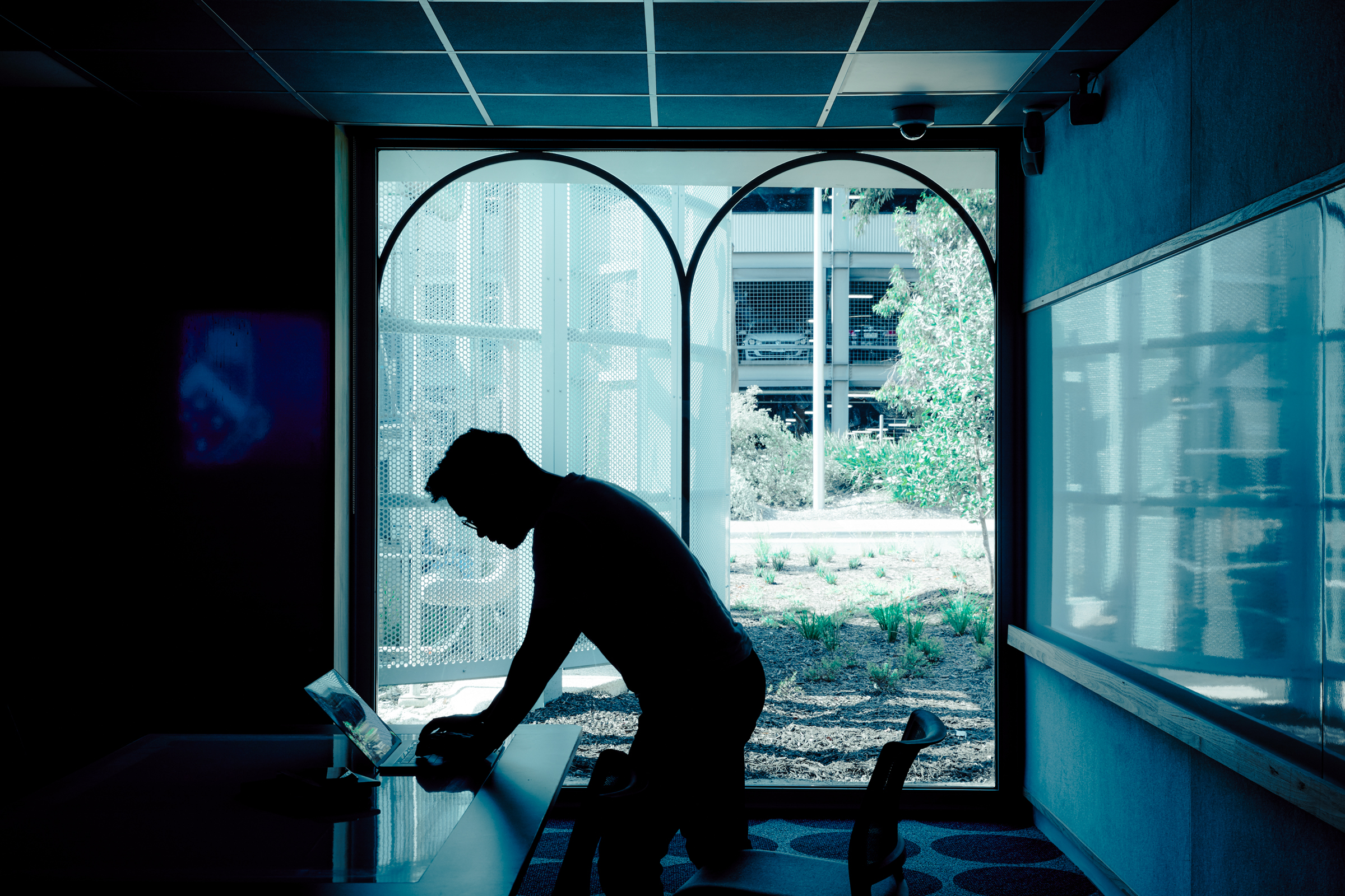
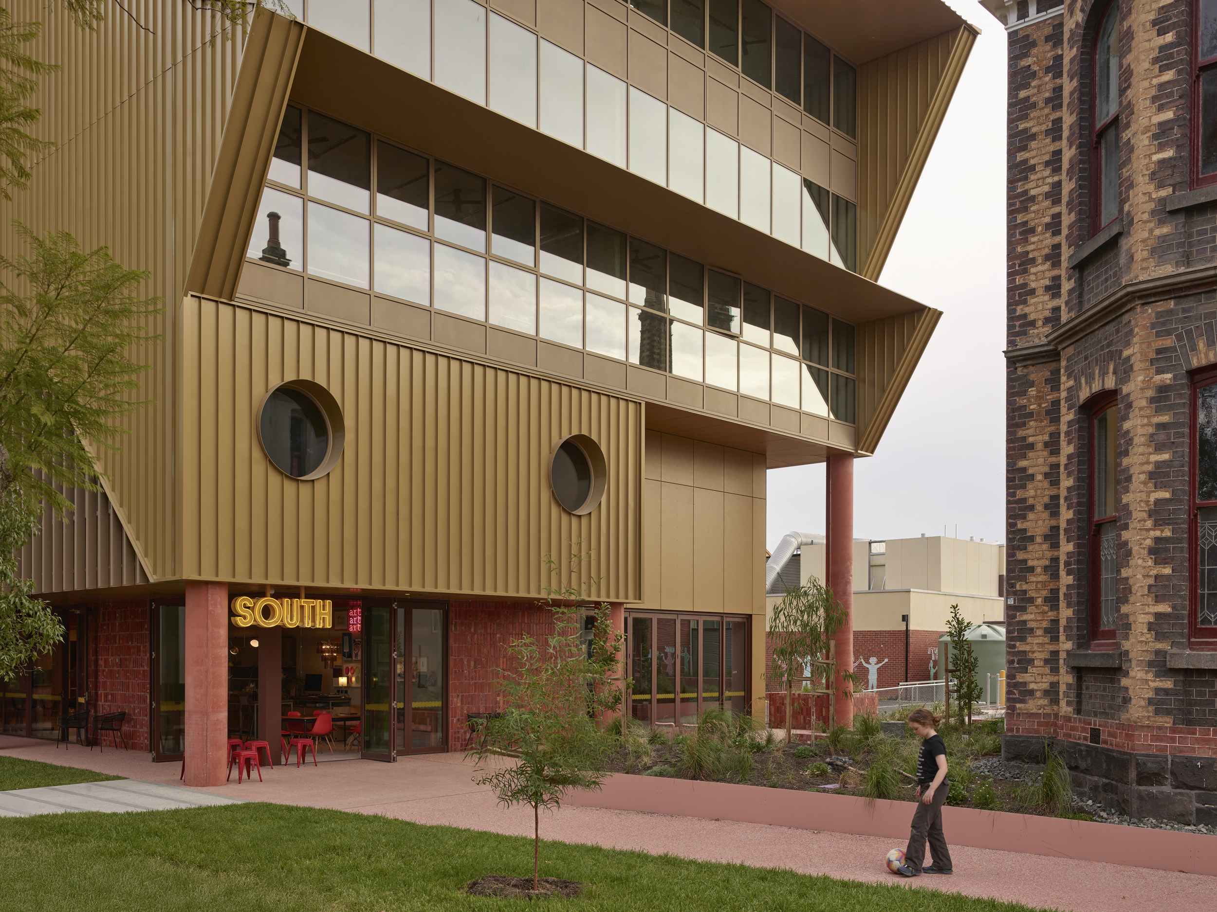
Monash is motivated to provide facilities to encourage students to feel safe and supported on campus – to provide places for students for informal study and somewhere to be between classes and thus promote a vibrant campus life. Accordingly, our design aims for warmth and, within the constraints of Monash’s strict guidelines on performance and durability, a sense of domesticity as a respite from the institutional. We have deployed timber for texture and warmth, and upholstered furniture for a sense of cosiness and familiarity. The project has had a broader effect on the campus too - radically opening up the previously blank walls of the university server and presenting a warm and reassuring lightbox at a key entry point to the campus from the main car park. The design achieves a strong and important connection to the adjacent landscape and wider university community both physically and visually.
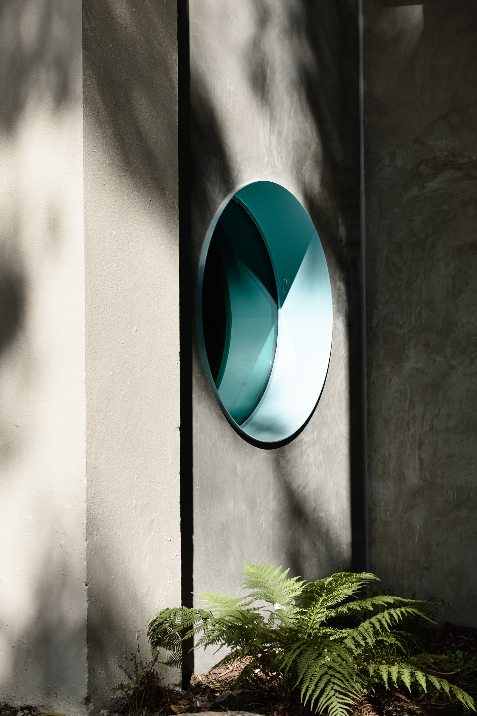
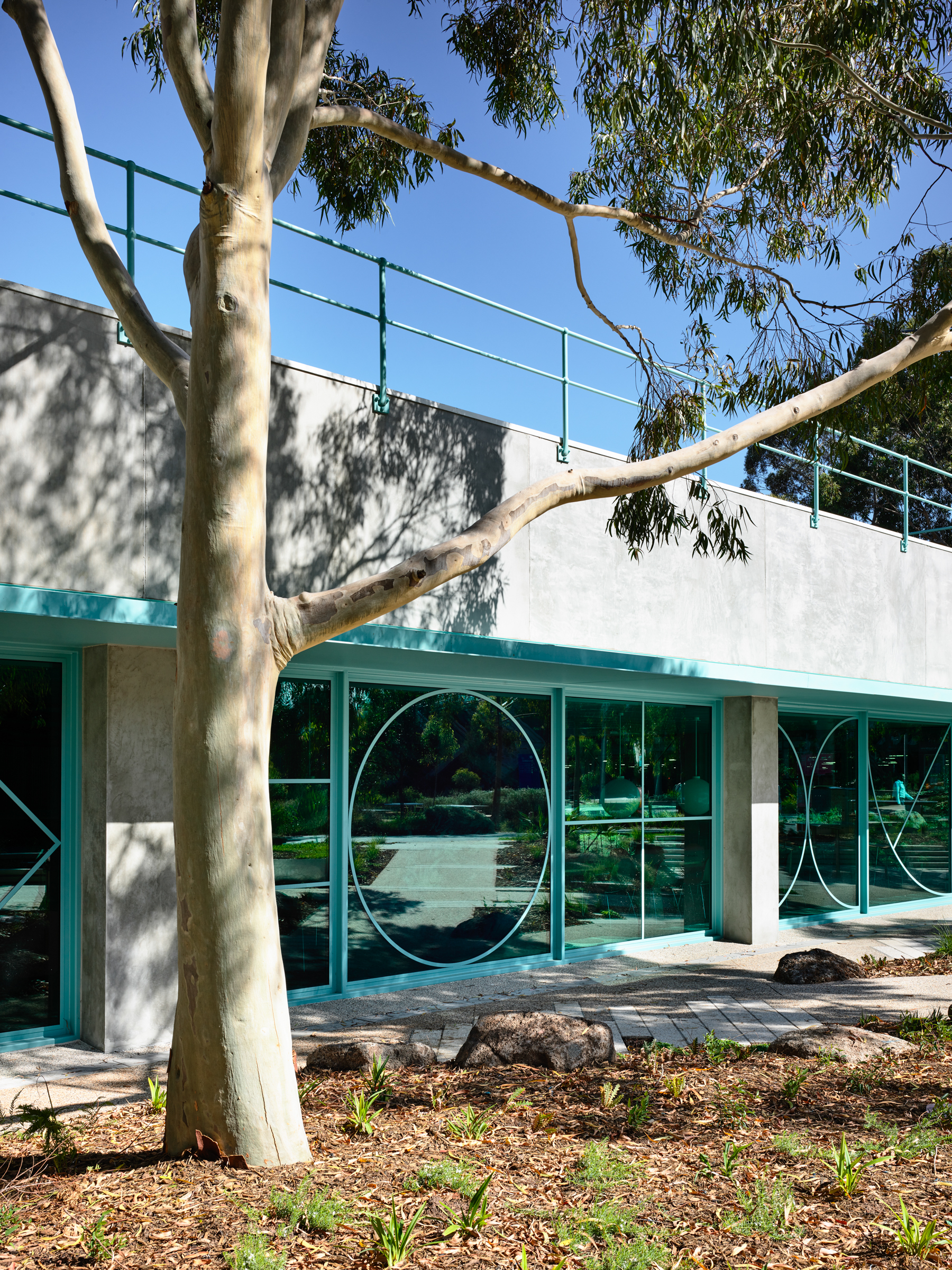
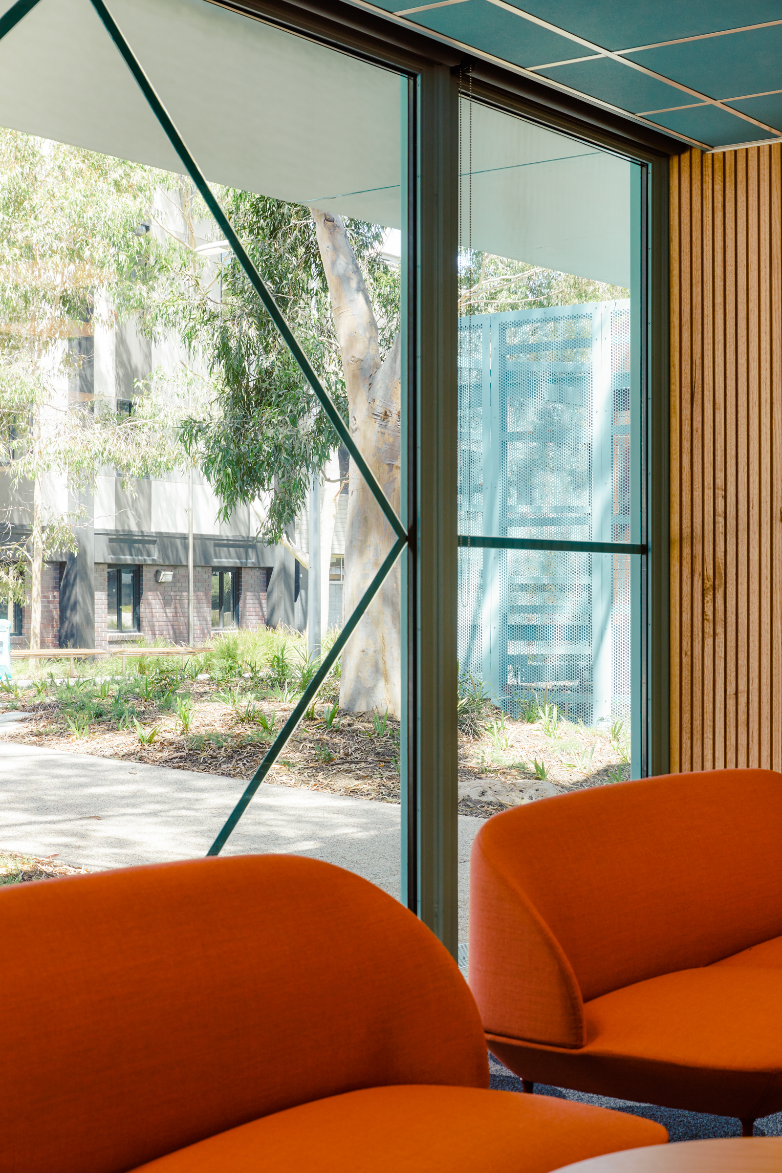
The new design expression is responsive to the existing building’s austere, functional modernism – rational planning, cartesian geometry and a limited material and colour palette. Embedded in this design approach is a close reading of the user groups, with elements that are familiar and engaging, but not so obvious that they would alienate other users. Examples of this approach include the new glazed facades which incorporate playful mullion geometry which are also mathematical symbols, and an entry portal which is an abstraction of the Pi symbol. The use of graph-paper gridlines on internal glazing and whiteboards softens their appearance and also provides a useful armature for calculations, while the colour scheme references the graph paper used by students in the faculty.
